What Is Typography?
From a descriptive and simplistic point-of-view, typography is the arrangement of type. But there is so much more to it than that. It can mean different things depending on whom you ask.
For me, how typography is used in a design is deeply rooted in its overall theme, tone and message. It works with your layout, grid and color choice to create a well-rounded design.
It’s this level of integration with a design theme that makes typography one of the most powerful tools in the designer’s toolbox.
basic typography terms and concepts
Lines
These horizontal lines are guides for capital letters, ascenders, lowercase and descenders (we’ll discuss these terms shortly).
Draw this:
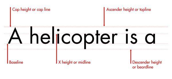
▪ Baseline: This is the line that the text sits on.
▪ Cap height (or cap line): This marks the top of capital letters.
▪ Ascender height (or topline): This line shows where the top of letters such as h and l touch.
▪ X-height (or midline): This shows the height of lowercase letters
Descender height: Descenders are the parts of characters that go below the baseline (such as the letters p and y).
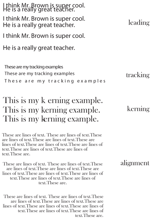
Leading
Leading describes the amount of space between lines of text. You can measure leading by obtaining the distance between two baselines..
Leading describes the amount of space between lines of text. You can measure leading by obtaining the distance between two baselines..
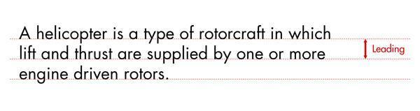
Leading is powerful. It can affect how readable long blocks of text are.
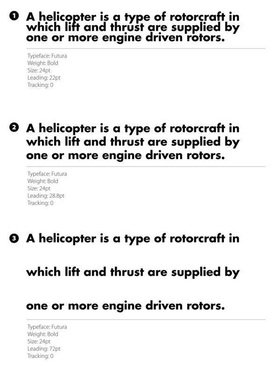
When you decrease leading, lines get closer to each other, making a block of text appear more compacted. Lowering the amount of leading can cause descenders and ascenders to collide, and this could have an adverse effect on readability. But as a visual style, low amounts of leading can increase the pace of the reader and invoke the feeling of cramped conditions and claustrophobia, which can be desired when you are using type in this expressive manner.
When you decrease leading, lines get closer to each other, making a block of text appear more compacted. Lowering the amount of leading can cause descenders and ascenders to collide, and this could have an adverse effect on readability. But as a visual style, low amounts of leading can increase the pace of the reader and invoke the feeling of cramped conditions and claustrophobia, which can be desired when you are using type in this expressive manner.
|
▪ Example 1 is set to a negative value (a value that is smaller than the type size). You can see the ascenders colliding with descenders and its effects on readability and aesthetics.
▪ Example 2 is set at an often-recommended value, which is 120% of the type size. This means that if your font size is 10pt, then leading should be set at 12pt. ▪ Example 3 is set to 200% of the type size. You’ll notice the disruption in the pace and flow of reading the text. |
Tracking
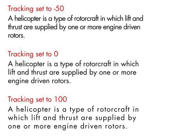
Tracking (or letter-spacing) is the space between groups of characters.
Tracking (or letter-spacing) is the space between groups of characters.
|
Tracking can be described as being loose or tight. Loose tracking is when the letters have a larger distance between them. Tight tracking is when the letters are closer.
The longer your line the more loose your tracking needs to be. This rule is not set in stone. Variables such as typeface choice, background color, number of columns and the surrounding design elements can also influence the readability of a block of text. Each time you set type, you should be looking at the overall picture. |
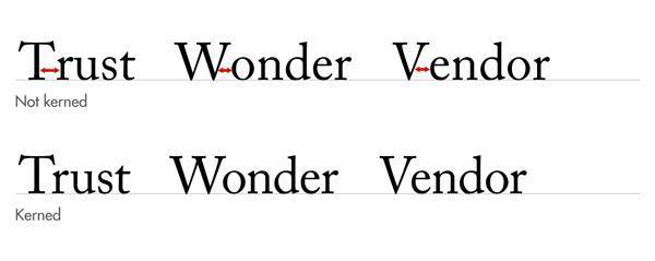
Kerning
Kerning describes the amount of space between two characters.
Kerning describes the amount of space between two characters.
|
There is often confusion between tracking and kerning. While tracking is a global setting that affects how close all the characters are, kerning is the space between two letters.
Kerning is the art of adjusting the space between characters so that the eye can flow easily across the text without being distracted by discrepancies. Remember: good typography is never noticed. |
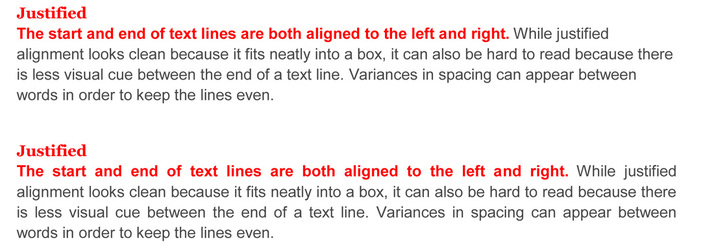
Alignment
How you align your text has a huge impact on how people will read and perceive it. The decision of alignment should be made with your design theme in mind, and of course, readability and legibility.
Flush Left
Text is aligned to the left. This alignment complements the natural way we read text in western culture. When done correctly, it is one of the biggest factors in improved readability. Be sure to pay attention to the right-hand side (or the rag). It is important to make sure there is a good balance with line length; make sure that they are not too similar, but also not too far apart.
Flush Right
Text is aligned to the right. If we read from left to right, flush right can hamper the natural flow of the text.
Use it as a contrast to the main body of text to highlight complementary copy.
Text is aligned to the right. If we read from left to right, flush right can hamper the natural flow of the text.
Use it as a contrast to the main body of text to highlight complementary copy.
Centered
Text is aligned to the center of the text area, rather than the edges.
Exercise caution when using centered alignment — there is nothing worse than poorly set centered text. There is no shared point where the line begins and ends, so it can be very hard to read.
Text is aligned to the center of the text area, rather than the edges.
Exercise caution when using centered alignment — there is nothing worse than poorly set centered text. There is no shared point where the line begins and ends, so it can be very hard to read.
Basic typography changes in illustrator examples assignment.
|
On a single illustrator document create your own examples of these changes.
|
On a single illustrator document create your own examples of these changes.
|
