-TYPEFACES- or Fonts...
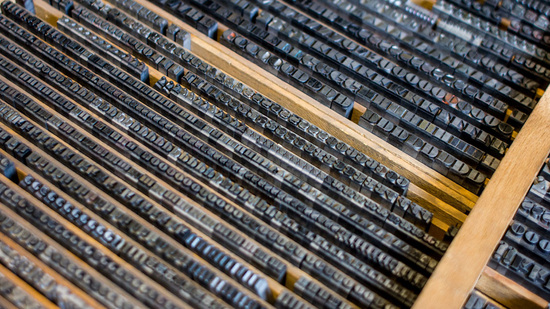
Back in the good old days of analog printing, every page was laboriously set out in frames with metal letters. That was rolled in ink, and then it was pressed down onto a clean piece of paper. That was a page layout. Printers needed thousands of physical metal blocks, each with the character it was meant to represent set out in relief (the typeface). If you wanted to print Garamond, for example, you needed different blocks for every different size (10 point, 12 point, 14 point, and so on) and weight (bold, light, medium).
This is where we get the terms typeface and font. In the example above, Garamond would be the typeface: It described all of the thousands of metal blocks a printer might have on hand and which had been designed with the same basic design principles. But a font was something else entirely. A font described a subset of blocks in that very typeface--but each font embodied a particular size and weight. For example, bolded Garamond in 12 point was considered a different font than normal Garamond in 8 point, and italicized Times New Roman at 24 point would be considered a different font than italicized Times New Roman at 28 point.
Even type experts agree: Typeface and font can be used interchangeably at this point. But if you come across an annoying "expert" who cares deeply about maintaining the distinction for the everyday users, just remember this: The difference between a font and a typeface is the same as that between a song and an entire album.
|
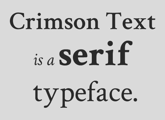
Serif
Serif typefaces are called “serifs” in reference to the small lines that are attached to the main strokes of the letters. Serif typefaces are most often used for body copy in print documents, as well as for both body text and headlines online. |
|
|
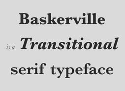
Within the serif classification, there are many sub-types.
Old Style serifs the thinnest parts of the letters appear on the angled strokes, rather than the vertical or horizontal ones. |
|
|
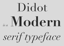
Modern serifs, have a much more pronounced contrast between thin and thick lines. Draw the M!!
|
|
|
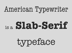
Slab serifs have little to no contrast between thick and thin lines, and have thick, rectangular serifs. Draw the capital S
|
|
|
Sans-Serif
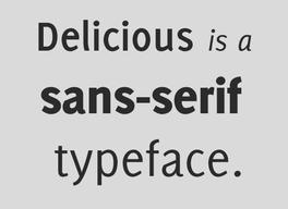
Sans-serif typefaces are called such because they lack serif details on characters. Sans-serif typefaces are often more modern in appearance. |
|
|
|
Display
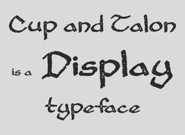
Display typefaces main characteristic is that they’re unsuitable for body copy and are best reserved for headlines or other short copy that needs attention drawn to it. |
|
|
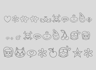
Dingbats and Specialty Typefaces Dingbats are specialty typefaces that consist of symbols and ornaments instead of letters. |
|
|
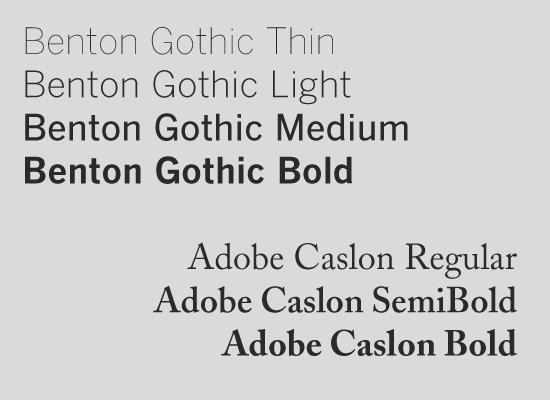
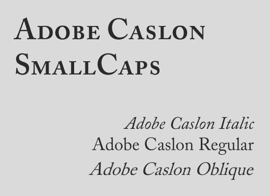
Weights & Styles Within the majority of typefaces, you’ll find more than one style and/or weight. Weights are often classified as “light”, “thin”, “regular”, “medium”, “bold”, “heavy”, or “black”. Each of these refers to the thickness of the strokes that make up the characters: There are three general styles you’ll find with many typefaces: italic, oblique, and small caps. Small caps are often used for headings or subheadings, to add variety to your typography if using a single typeface. |
|
